
Inspired by CSS Sprites2 – It’s JavaScript Time from A List Apart and Using jQuery for Background Image Animations written over a year ago, I decided to create a short tutorial about an animated menu just using CSS3. In fact, I am using the same principle of moving the background image from one position to another, in this case from left to right, the only difference is that I am using the CSS3 property transition to create the animations. This shows us how powerful CSS3 can be and how we can save some JavaScript code to achieve the same result. As you know, right now the transition property is only supported by Safari and Chrome.
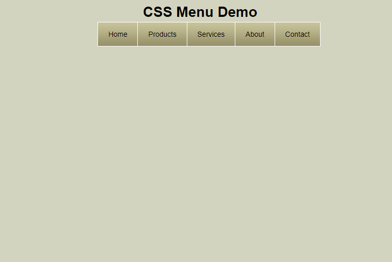
HTML Structure
First, we create an unordered list with “menu” as the ID, in which we create 5 items containing links that would be enough for this tutorial.
Background Image
The background image to use in the animation is this one.

Styling with CSS
Adding the style to create the menu and its animation. The CSS3 property used is transition.
#menu li {
                display: inline;
                list-style: none;
                padding: 0;
            }

#menu li a {

               border: 1px solid white;
               padding: 15px 20px 15px 20px;
               text-decoration: none;
               color:black;
               margin-left: -5px;
               /* This is the background used for the animation */
               background-image: url('image.jpg');
               /* Align the background image position to the left of the link */
               background-position: left;
               -webkit-transition: all 0.8s ease-in-out;
               /* Animation with transition in Firefox (No supported Yet) */
               -moz-transition: all 0.8s ease-in-out;
               /* Animation with transition in Opera (No supported Yet)*/
               -o-transition: all 0.8s ease-in-out;
            }
With the mouse over we complete the transition effect in CSS3. The menu items will change their properties in 0.8 seconds.
#menu li a:hover {
                color: white;
                /* Align the background image position of the background to the right*/
                background-position:right;
            }
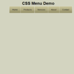
Demo
You can see the live demo or download the files to test locally.