

There is a famous quote attributed to Benjamin Disraeli: “There are three kinds of lies: lies, damned lies, and statistics.” As this became very common, I would like to discuss one way how data could be misleading.
One of the most common sources of information and data is the news. I tend to look for several sources to understand what is happening in the world. However, I found that some of the news might present biased information to make their points. At least, they try to mask the truth with wrong numbers and graphs. For instance, Fox News has a track record of using misleading data that convince the misinformed and misinform the educated.
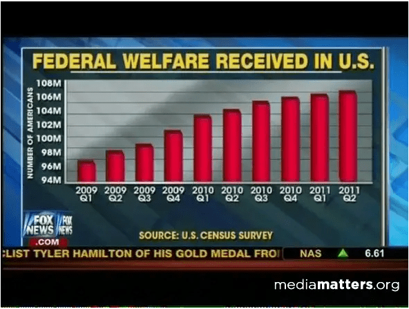
I remember flipping through the channels and seeing the bar chart of the Federal Welfare on Fox News where there was a huge jump in the graph from the first quarter of 2009 to the second quarter of 2011. But, with little knowledge of statistics or data visualization people would notice that the Y-axis should start at zero because it could have a false visual comparison of the data. Instead, Fox News decided to start the Y-axis with 94 million, making the differences between quarters disproportionated. Bar charts make it easier for our eyes to compare categories (Cole Nussbaumer Knaflic, 2015). However, as eyes compare the relative endpoints of the bars, it is required to have the baseline set to zero (Cole Nussbaumer Knaflic, 2015) so we can compare the proportion of the entire bars.
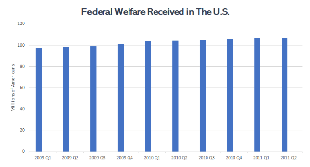
In the graph below I have the same numbers but the Y-axis starts with zero. This is a more accurate graph because it shows the real relationship in sizes between the bars. Also, the first graph has a zoom effect in the top parts of the bars which makes the difference more visually prominent.
I think that data could get us confused because we are taught that math is difficult. Then, when we see numbers we immediately trust them without stopping for a second to make the calculations ourselves. Also, in terms of the news, I believe that people tend to believe whatever confirms their own beliefs without questioning the information. However, it should be a responsibility to present the news in a professional matter and follow best practices so people can make informed decisions based on the news.
Reference
Cole Nussbaumer Knaflic. (2015). Storytelling with Data A Data Visualization Guide for Business Professionals. Hoboken, NJ, USA John Wiley & Sons, Inc.