usability
-

Strategies for User Behavior Analysis
This article explorers some strategies that will help you understand the…
-

MaxiBlocks Review – It Could Be a Game Changer
I have used a lot of page builders and I even…
-

Building Empathy for the Users
Empathy can be seen as being able to share and understand…
-

The UX Design Process I Use with My Projects
There are a lot of versions of the user centered design…
-

Microsoft Edge is Now My Favorite Browser
Microsoft started using Blink a while back and has enhanced its…
-

The Biggest Lie: We Care About Our Users
For some companies, there are a lot of buzzwords and terms…
-

Usability and Accessibility
Even today, some people confuse the terms usability and accessibility. Others…
-

The 60-30-10 Color Rule in UI Design
Looking for inspiration and how to design UI is hard enough.…
-

Conducting Heuristic Evaluations for UX Design
Heuristic Evaluation is a procedure performed by Usability experts to assess…
-

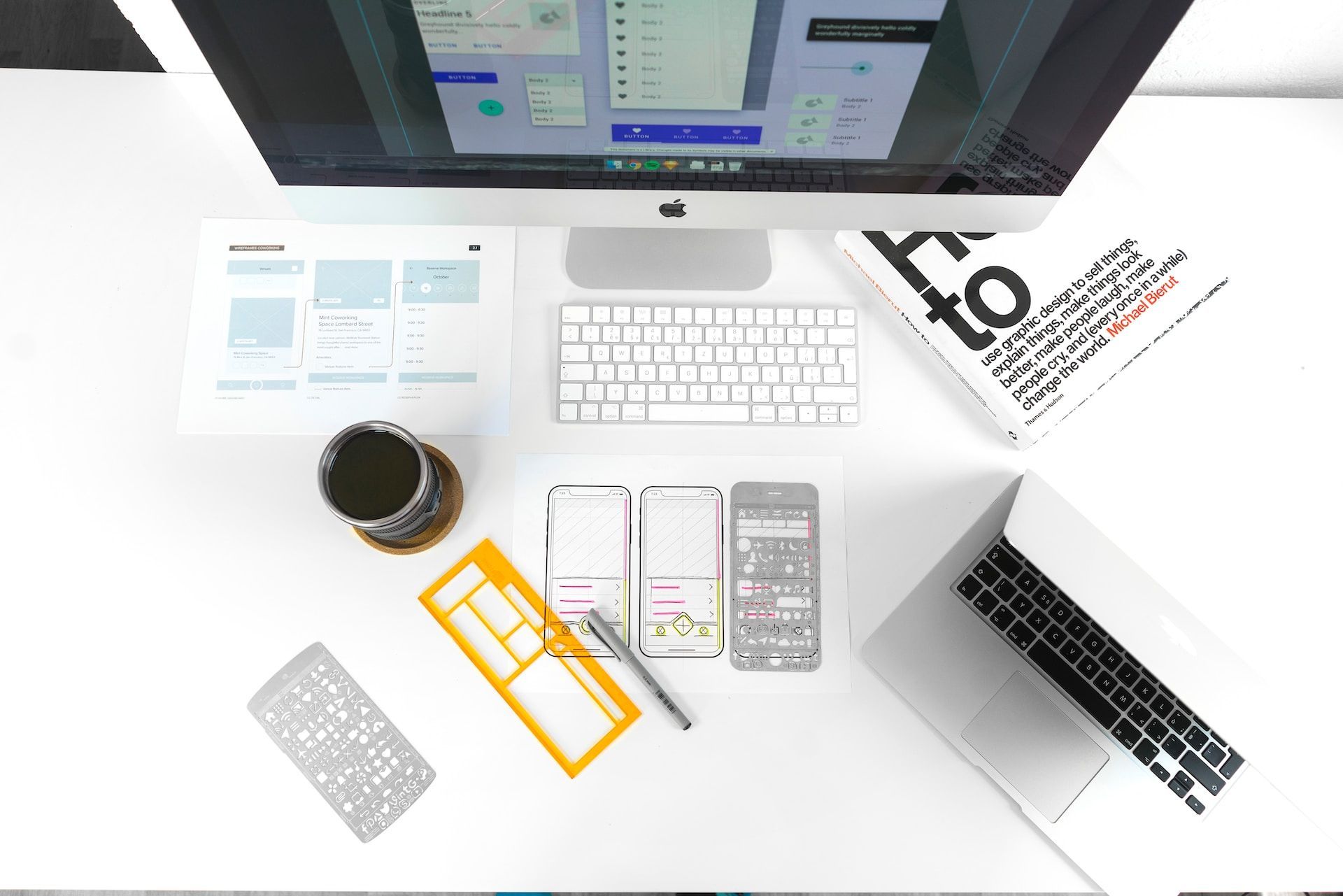
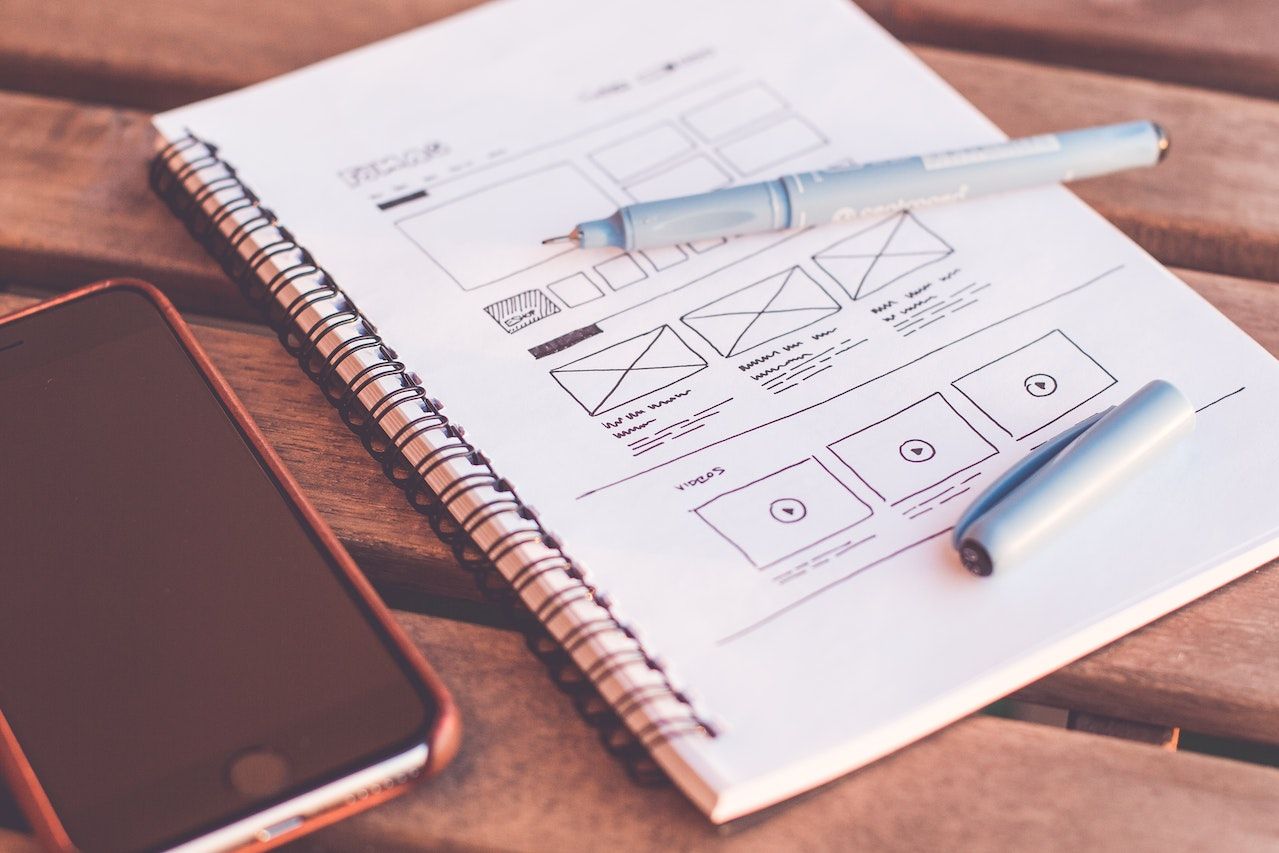
Sketch, Wireframe, Mockup, and Prototype
There is always confusion between sketches, wireframes, and mockups. Here, I…
-

Factors that Influence a System’s Maintainability
Sometimes, even when the system is no longer relevant, it needs…
-

Animations Should Not Be the UX
Animations can enhance the user experience and how users feel when…

