Creating a Bubble Coda Style with CSS3
May 12th, 2010 by Tweet
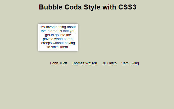
As I have previously mentioned, CSS3 allows for web techniques such as: text shadows, rounded borders, animations, custom web fonts, and much more. CSS3 has a great future in web development and I have being reading and learning as much as I can about it! The downside currently to CSS3 is that some properties of CSS3 are only being supported by Safari and Chrome; however, Opera started supporting some, but the implementation is still buggy. I have prepared a few other tutorials about how to use CSS3 to make an image gallery with animation and an animated horizontal menu. Continuing with the CSS3 tutorials, today we are going to create a tooltip using the famous coda style, which allows for an animated pop-up window that makes for a great effect. I hope you find the tutorial useful! Enjoy!
HTML
First, we create our HTML file and inside the body tag we add the following code. It is an unordered list which is going to have inside a text and next to it a “div” tag that is going to be the tooltip or bubble to display with the hover action to the “li” tag.
CSS
We declare the unordered list as inline and adding the cursor pointer for usability reasons.
#bubblemenu li {
display: inline;
margin-left: 15px;
cursor:pointer;
}
At the second part, we select the “div” that is inside the “li” to style it. Notice that the visibility is hidden and the opacity is zero. Additionally, we add some fancy stuff like rounded bordes and shadows to make it look more like the coda menu. Also, it has the transition effects which set the return state in 0.5s after the mouse out the “li” tag.
#bubblemenu li > div {
width: 150px;
min-height: 100px;
position: absolute;
display: inline;
margin-left: -120px;
padding: 5px;
visibility:hidden;
opacity: 0;
margin-top: -125px;
background: #ffffff;
font-size:1em;
/* Setting the border-radius property for all Browsers */
-moz-border-radius: 5px; /* Firefox */
-webkit-border-radius: 5px; /* Safari and Chrome */
border-radius: 5px; /* Browsers that Support it like Opera */
/* Setting the box-shadow property for all Browsers */
-moz-box-shadow: 0 0 8px gray; /* Firefox */
-webkit-box-shadow: 0 0 8px gray; /* Safari and Chrome */
filter: progid:DXImageTransform.Microsoft.Shadow(color='#272229', Direction=135, Strength=3); /* IE */
box-shadow: 0 0 8px gray; /* Browsers that Support it like Opera */
/* Setting the transition property for all Browsers */
-moz-transition: all 0.5s ease-in-out; /* Firefox */
-webkit-transition: all 0.5s ease-in-out; /* Safari and Chrome */
-o-transition: all 0.5s ease-in-out; /* Opera */
transition: all 0.5s ease-in-out; /* Browsers that Support it */
}
With the hover effect we create a transition putting the “div” tag visible and and the opacity to 1. Additionally, we move the “div” to the top by 30px.
#bubblemenu li:hover > div {
visibility:visible;
opacity: 1;
margin-top: -150px;
/* Setting the transition property for all Browsers */
-moz-transition: all 0.5s ease-in-out; /* Firefox */
-webkit-transition: all 0.5s ease-in-out; /* Safari and Chrome */
-o-transition: all 0.5s ease-in-out; /* Opera */
transition: all 0.5s ease-in-out; /* Browsers that Support it */
}
We are done!
Want to pass 199-01? Check out our latest 70-647 study guides along with 70-291 dumps, E20-329 braindumps , and 9A0-150 dumps dumps which give you 100% exam pass guarantee.
Totally awesome Pearl Necklaces available at LusterForever.com.
Teylor Feliz is a well-known XHTML/CSS/JavaScript enthusiast from Dominican Republic. He has more than 10 years experience in the computer programming, graphic design, and web development world, including 2 years teaching computer science. Teylor has a degree in Applied Sciences from the University of Louisiana and is completing a Master’s degree in IT with a concentration in Web Design and Development, at the University of Denver.
Subscribe to our RSS
Please help us to promote this article.


I love the bubble coda style, and it´s awesome to be able to do it only with css3. Thanks for the tut Teylor!
I am glad you liked it! Thanks for the comment!
Wow.. this is cool stuff.. I had seen this effect somewhere before, i think in some Apple related site…. but this is superbly executed.
Good work
As you can see, it is not too difficult! I am glad you liked the tutorial! Thanks for the comment!
Nice tuto! thx for sharing!
Thanks Bro! Glad you liked it!
nice effects ! i really liked them when i saw them in other site, but dont know how to make this ! thanks for sharing , i ll give a try!!
Try implementing it! I am glad you liked it! I think it gives a great effect too
Great tutorial as always man! Keep up the great work!
Thanks! Glad you enjoyed it!
Useful Post Teylor, Rtedd and bumped , Cheers
Thanks man for always supporting us! I really appreciate it! Thanks for the comment
Great technique mate…Keep it up…very good explained.
Thanks for the comment, and come back soon!
really useful technique. thanks
I am glad you found it useful; it is why I do these tutorials! When people can put them to use, it makes it so worth it! Thanks for commenting and come back soon!
Hi,
Thanks for a interesting tutorial! I created a menu example with your technique in combination with CSS3-styled bubbles at http://css3.se/bubblor.html . The code could probably be more tidy and organized, but it works really good.
Very nice, thanks for sharing!
I tried to do this the other day and ended up with a very similar code structure. In the end, I used .png again.
The only reason for it is that the tooltips NEEDED the little arrow. I couldn’t neglect it. I was able to add the arrow and add a border to the arrow itself (all with just CSS), but it was impossible to add a box-shadow to it.
Still, it’d be good to show how to add the arrow to the tooltip, for people that might like it.
I haven’t try but maybe with a small div with rotation we can get that effect.
Thanks for your comment!
What I tried was actually an :after selector with content to get it done. From there, some trickery with borders and positioning and you get the arrow. Problem was the shadow. ): And it looked pretty weird having a shadow on the whole bubble box but not on the small “tip” (go to youtube and hover over any video title on the video list page, you’ll get a taste of what I mean).
I worked fast on this and I came up with this demo.
http://www.admixweb.com/demos/arrowdemo/
Thanks for your comment.
BTW: Me gusto muchisimo el tutorial que hiciste para SMag, me gusta ver como los latinos cuando se destacan. Suerte!!!!
Not trying to be, though I certainly am being picky, but there are three things I dislike from that approach (which I thought of too, believe me).
1) It uses moz-transform (I like border trickeries a lot more, but this really is a matter of choice).
2) The shadow of the tip overlaps with the one of the box and looks darker at some point (yes, it is a matter of 1 or 2 px… sorry, told ya I was being slightly picky :/ ).
3) The extra div element. I’m all for simple code first, aesthetics after.
It is one of many solutions, indeed.
And a nice addition to the article.
Props for that. Will post my own approach soon.
P.D. Muchas gracias.
Tiene mucho que lo escribí y no toda la información es acertada ya (por ejemplo, legend ya no se usa como el caption de figure. Ahora es figcaption
). Saludos desde México.
I agree with your comment, but this is just a quick approach that it took me only like 3 minutes. However, in relation with the shadow you have to use lens to see the different.
In my opinion, you should use images in real life that avoid browser issues.
Thanks for you comment again and I wait for your approach
Youre kidding me right? IE does actually support the transition attribute in a cleaner way than anybody else?
Thats probably the first time i have to give them kudos for anything.
More than Transitions, I would prefer to say that they are filters and animations from DHTML era and there is no property similar to the CSS3 one.
Thats one fine example of what CSS3 can do ! I am so impressed. But its too bad IE is yet to catch up on the CSS3 and half of the world is still grabbing on to IE. I am adding this tutorial to my CSS aggregator site. Hope you dont mind.
Thanks for the comment and feel free to add a link to my tutorial on your site! Thanks!
Teylor,
You rock!!! I’m a student building my first website with CSS and Javascript, and have spent so much time searching for an easy-to-do, but nice-looking lightbox-like effect for an image gallery. YOU ARE A GOD!! I have to thank you for this easy to understand effect. You have saved me, my project and most importantly, my sanity!!
Thanks for rockin’ it!! : )
xoxo
Teylor,
Thanks for your awesome tutorial. However, I found an issue with it I’d like to address. In your demo, if you roll over a link, say “Penn Jilliet”, the white box animates up. If you quickly roll over the white box so that your cursor is over the quote, the white box doesn’t fade out. In other words, rolling over the box stops it from disappearing.
From a usability standpoint, I would like to see the white box fade in when you roll over the link and then fade out regardless of where you move your cursor just as long as you roll off the link. Does that makes sense?
Is there anyway you can do that with CSS3?
Thanks,
Anthony
Hey, is there a way to do this with clicking instead of hovering? … can anyone please try this with li:click or something or jquery? I need an answer on how to do it
(
Sorry, I just arrived from my vacation. I will try this and let you know ASAP.
Did you try a:active?
Thanks for the comment!
nope, isn’t a:active for only holding the mouse click? … I want it to be clicked once, then bubble popups.
( and vice-versa, for closing it. )
Thx
.. because I want this to work on iDevices, such iPhone or iPad. (by clicking instead of hovering) .. Thx
Simple and effective, thanks! I like that the animation ‘cancels’ when you hover out, it would be pretty hard to accomplish the same think with JS.