
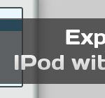
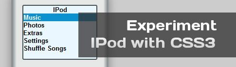
For today’s post, I got inspired by Ahmed El Gabri and his article CSS3 Gradients Coffee cup. I figured if you could make a coffee cup, you could make just about anything with CSS3! For example, today I created a realistic Ipod just with CSS3 and no images at all.
First of all, I recommend to do this with canvas; I just used CSS3 in order to better understand the gradient property in Safari and Chrome (webkit) and have some fun during the process of learning :) .
Second of all, if you are going to check it out and want to get the full effect, I recommend Firefox, Safari or Chrome because they really support the gradients.
Lastly, feel free to read some of my other CSS3 tutorials to get a back ground on how it works!
HTML
- IPod
- Music
- Photos
- Extras
- Settings
- Shuffle Songs
CSS
#ipod {
	margin:0 auto 0 auto;
	height:423px;
	padding-top:23px;
	width:198px;
	background:-moz-linear-gradient(left, #798382, #e5e7e6 5%, #e5e7e6 95%, #798382 100%);
	background: -webkit-gradient(linear, left top, right top, from(#798382), color-stop(0.06, #e5e7e6), color-stop(0.94, #e5e7e6), to(#798382));
	-moz-box-shadow: 0px 5px 25px gray; /* Firefox */
	-webkit-box-shadow: 0px 5px 25px gray; /* Safari and Chrome */
	box-shadow: 0 0 25px gray;
	font-family:Arial, Helvetica, sans-serif;
	border:1px solid #999;
}
#screen {
	width:150px;
	height:110px;
	border:3px solid #415053;
	margin-left:auto;
	margin-right:auto;
	position:relative;
	font-size:13px;
	background:#eaf7ff;
	font-weight:bold;
	padding:0;
	-webkit-border-radius:3px;
	-moz-border-radius:3px;
}
#screen ul {
	display:block;
	padding:0;
	cursor:pointer;
	margin:0;
}
 #screen ul :nth-child(1) {
 text-align:center;
}
 #screen ul :nth-child(1):hover {
 background:none;
color:black;
}
#screen li {
	list-style:none;
}
 #screen ul li:nth-child(2) {
 background:#0b91d0;
 color:#ffffff;
}
 #screen ul:hover li, #screen ul:nth-child(2) {
 background:none;
 color:#000;
}
#screen ul li:hover {
	background:#0b91d0;
	color:#ffffff;
}
#button {
	width:150px;
	height:150px;
	-moz-border-radius:150px;
	-webkit-border-radius:150px;
	border-radius:150px;
	border:1px solid gray;
	margin:70px auto;
	background:#fbfcfe;
}
#centerbutton {
	width:70px;
	height:70px;
	-moz-border-radius:70px;
	-webkit-border-radius:70px;
	border-radius:70px;
	border:1px solid gray;
	margin:40px auto;
	background:-moz-linear-gradient(100% 50%, #e2e4e3, #ebedec);
	background:-webkit-gradient(linear, 0% 0%, 0% 100%, from(#e2e4e3), to(#ebedec));
}
#menub {
	position:absolute;
	margin:10px auto 0 55px;
}
#prevb {
	position:absolute;
	margin:60px auto 0 10px;
	font-size:20px;
}
#nextb {
	position:absolute;
	margin:60px auto 0 130px;
	font-size:20px;
}
#playpauseb {
	position:absolute;
	margin:120px auto 0 70px;
}
.btn {
	font-weight:bold;
	color:#b5bfc8;
}