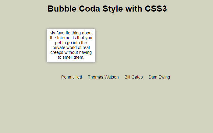
As I have previously mentioned, CSS3 allows for web techniques such as: text shadows, rounded borders, animations, custom web fonts, and much more. CSS3 has a great future in web development and I have being reading and learning as much as I can about it! The downside currently to CSS3 is that some properties of CSS3 are only being supported by Safari and Chrome; however, Opera started supporting some, but the implementation is still buggy. I have prepared a few other tutorials about how to use CSS3 to make an image gallery with animation and an animated horizontal menu. Continuing with the CSS3 tutorials, today we are going to create a tooltip using the famous coda style, which allows for an animated pop-up window that makes for a great effect. I hope you find the tutorial useful! Enjoy!
HTML
First, we create our HTML file and inside the body tag we add the following code. It is an unordered list which is going to have inside a text and next to it a “div” tag that is going to be the tooltip or bubble to display with the hover action to the “li” tag.
CSS
We declare the unordered list as inline and adding the cursor pointer for usability reasons.
 #bubblemenu li {
    display: inline;
    margin-left: 15px;
    cursor:pointer;
 }
At the second part, we select the “div” that is inside the “li” to style it. Notice that the visibility is hidden and the opacity is zero. Additionally, we add some fancy stuff like rounded borders and shadows to make it look more like the coda menu. Also, it has the transition effects which set the return state in 0.5s after the mouse out the “li” tag.
 #bubblemenu li > div {
                width: 150px;
                min-height: 100px;
  	        position: absolute;
                display: inline;
                margin-left: -120px;
                padding: 5px;
		visibility:hidden;
                opacity: 0;
                margin-top: -125px;
		background: #ffffff;
		font-size:1em;

		/* Setting the border-radius property for all Browsers */
                -moz-border-radius: 5px; /* Firefox */
                -webkit-border-radius: 5px; /* Safari and Chrome */
                border-radius: 5px; /* Browsers that Support it like Opera */

		/* Setting the box-shadow property for all Browsers */
                -moz-box-shadow: 0 0 8px gray; /* Firefox */
                -webkit-box-shadow: 0 0 8px gray; /* Safari and Chrome */
		filter: progid:DXImageTransform.Microsoft.Shadow(color='#272229', Direction=135, Strength=3); /* IE */
                box-shadow: 0 0 8px gray; /* Browsers that Support it like Opera */

		/* Setting the transition property for all Browsers */
		-moz-transition: all 0.5s ease-in-out; /* Firefox */
                -webkit-transition: all 0.5s ease-in-out; /* Safari and Chrome */
                -o-transition: all 0.5s ease-in-out; /* Opera */
                transition: all 0.5s ease-in-out; /* Browsers that Support it */
            }
With the hover effect we create a transition putting the “div” tag visible and and the opacity to 1. Additionally, we move the “div” to the top by 30px.
#bubblemenu li:hover > div {
		visibility:visible;
                opacity: 1;
                margin-top: -150px;

               /* Setting the transition property for all Browsers */
		-moz-transition: all 0.5s ease-in-out; /* Firefox */
                -webkit-transition: all 0.5s ease-in-out; /* Safari and Chrome */
                -o-transition: all 0.5s ease-in-out;  /* Opera */
                transition: all 0.5s ease-in-out; /* Browsers that Support it */
}
We are done! You can see the example here.


