

During our most recent family vacation, I encountered several product design issues that inspired me to talk about affordances and constraints for product design. Also, I would like to add an example of one design flaw I saw during the trip with a hand sanitizer at an arcade store.
Affordances
Don Norman defines affordance as the clues of functionality given by an object which can be a device or a user interface (Ghaoui 2006). An example of affordance can be a pitcher with a lip because it shows you where you should pour the water to make it easier. However, in reality, a pitcher can be poured from all sides of the top. So, affordances are self-explanatory features that tell the user how the product should be used even when there is no manual present. For complex applications, it might be difficult, but we must show a product that is intuitive to the users.
Constraints
A constraint is a limitation on how to use an object or user interface (Ghaoui 2006). An example of a constraint is an outlet which gives clues on how to insert the plug into the outlet but there is only one way to insert the plug. Another constraint could be a light switch that lets the operators know they turn on or off the lights going up and down.
Hand Sanitizer Dispenser
How do you think this hand sanitizer dispenser works?
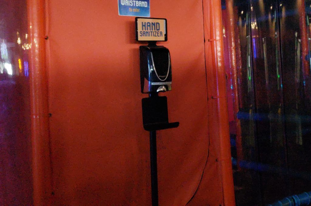
If you think that you can press the middle button to get the gel, you are in the wrong. This area is not a button and only has this shape as decoration. At first, I went and pressed the “button” to get some hand sanitizer to realize after the fact that it was an automatic dispenser. It was causing so many problems that management decided to provide a label instructing the users how to use the machine. Considering how many hand sanitizer dispensers we have seen in the last three years; we should be able to perform the task without thinking. The following is a close-up picture of the dispenser that explains how to use the machine “Automatic, please place hands above tray.”
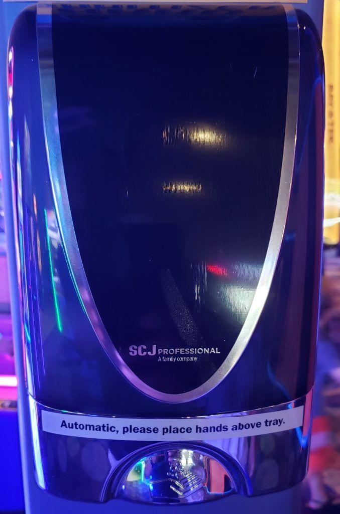
This hand sanitizer is an example of a bad design because the product provides something self-explanatory like the middle button that after using it, you realize that it is not what it is expected. At first, I didn’t read the label and tried to push the button. I thought that the button was locked, or the dispenser was running out of sanitizer. I bet that a lot of people encountered the same issue.
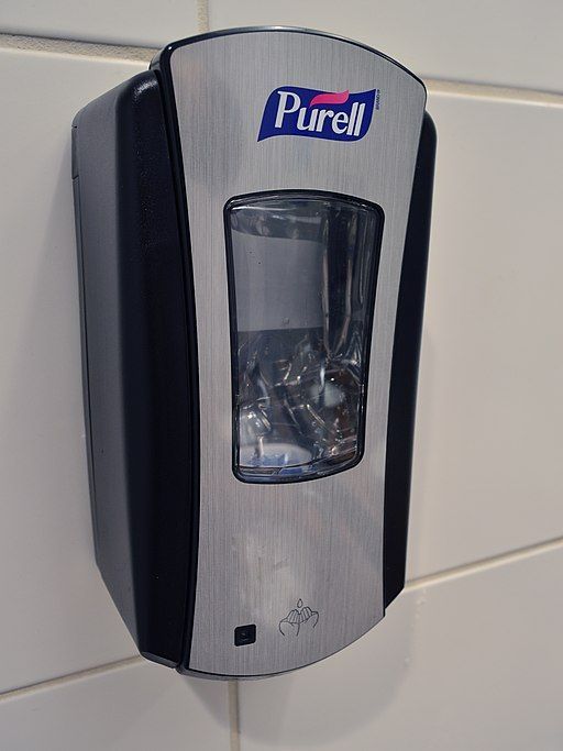
Just by removing the indentation in the middle that looks like a button and keeping a flat surface, it will imply that it is an automatic dispenser and people will locate the hands above the tray. You can confirm this with the following example that does not have a button.
In conclusion, we should still apply the “Don’t Make Me Think” principle in product design so products are easier to use, and don’t require “surprises” to the users.
Reference:
Ghaoui, C. (2006). Encyclopedia of Human Computer Interaction. United Kingdom: Idea Group Reference.