
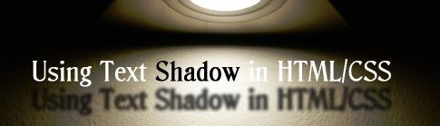
In this post, I will discuss the topic of using text-shadow in HTML/CSS. Text shadow is a property from CSS2, and what it does is simply apply shadow to the text. Moreover, text-shadow allows you to create a somewhat moved or blurred copy of a piece of text, to do positioned or color shadows, to create the appearance of 3D effects, to create more than one shadow (which gives an interesting effect all its own), and to make many other interesting effects. It is an interesting variation to use in design, to shake things up and create a distinction on your design; however, I do not suggest overusing it. Below is some information about using text-shadow in HTML/CSS that I hope you find useful. Please feel free to comment and leave your own ideas! Enjoy!
Syntax:
Where color is the color of the shadow, “x_offset” is the horizontal offset of the shadow, “y_offset” is the vertical offset of the shadow and “blur_radius” is how blur or smooth the shadow is going to be. Example:
.example {
 text-shadow: #000 5px 5px 2px;
}
Browsers with Support:
Currently, the following browsers support this feature: Opera 9.5+, Chrome, Firefox 3.5+, and Safari 1.1+. Historically, this feature was only supported by Safari, but now all recent major browsers support this property except IE.
What Can We Create?
We can create different effects with this property, we just need to be creative when using it. For example, we can create bury text to emulate the IE ClearType feature. We just add a little gray shadow to the text without any offset or a blur of 2px. See Some Examples.
Special Case: Internet Explorer
So, if this property is not supported by IE, I am sure your next question is what can we do to fix this problem? IE has special features for since the DHTML time called filters. Two of those filters are DropShadow and Shadow.
Using DropShadow
DropShadow and Shadow create a solid outline of the content of the object, which is offset in the specified direction. This effect creates an illusion that the content has a shadow.
The “offX” is the horizontal offset of the shadow, “offY” is the vertical offset of the shadow, “Color” is the color of the shadow, “Positive” creates a shadow from the nontransparent pixels of the object (Always set the positive property to 0, that would let you create the shadow), and “Enabled” indicates if the filter is available.
eShadow{
filter:progid:DXImageTransform.Microsoft.dropshadow(OffX=5, OffY=5, Color='gray', Positive='true');
}
Using Shadow
The syntax for shadow is as follow:
filter:progid:DXImageTransform.Microsoft.Shadow(Color, Direction, Strength,Enabled);
“Color” is the color of the shadow, “Direction” is where the shadow is offset, “Strength” is the number of pixels the filter would extend. “Direction” receives an integer parameter and NOT in pixels as would be expecting to be. Examples of “Direction”:
| Direction | Value |
|---|---|
| Top | 0 |
| Right Top | 45 |
| Right | 90 |
| Bottom Right | 135 |
| Bottom | 180 |
| Bottom Left | 225 |
| Default Left | 270 |
| Top Left | 315 |
Example:
.eiTextShadow{
	filter:progid:DXImageTransform.Microsoft.Shadow(color='#666666', Direction=135, Strength=4);
}
In the future we will be able to forget about this and use just the text-shadow attribute.