


When working in the world of web design and development, creativity is of course fundamental. However, it is more important to follow best practices to ensure greater usability, functionality, and ease for the users. Forms are one of the most disliked functions to deal with on the web for users when they are difficult to understand, or if they have no clear layout or design. Therefore, it is very important to use best practices when designing web forms. Here is a list of best practices in the area of web form design for you to use when designing or developing your next web form. Hope you find them useful! Enjoy!
Inline Validation
This is a great technique to utilize when making web forms because it checks the data for correctness immediately rather than waiting for the data to be submitted. Additionally, it gives the user the exact place of the invalid data, so that the user’s eye can go directly to the input control that needs to be changed.
Never use Ambiguous Labels
No pun intended, but this tip is pretty non-ambiguous because the header speaks for itself. So, remember to make your labels clear so that your users can understand who information needs to be in the input controls.
Associate Every Control with a Label
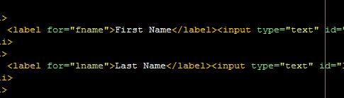
This tip seems obvious, but there are many forms online that do not correspond with this tip. When a form has various input controls that lack a clear label, the user will not know what information to place in the form. Therefore, it is essential to make sure that each input control contains a label to describe the data to be entered.
Appropriate Length of Input Control
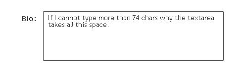
This method means that the width of the input control should be in accordance with the text introduced in it. For example, make sure you make the input control long enough for the text which you will enter, or make sure that you do not make the input control too long. In addition to this method, it is helpful to try to make similar input controls like first name, last name, street name, city, and state are relatively the same size, so it makes for a more unified form.
Adding a counter would be very useful for the user to know how much length remains in order to fill the textbox.
Be Flexible on How the Data Should Be Entered
It is important to allow flexibility when making your web form, to allow different variations of the information to be entered. Nothing is more irritating then not knowing how to enter information in a form, because every form is different. For example, for a phone number, allow for the number to be put in like 5555555555 or place the dashes in the form, so the user can know exactly how to enter the numbers.
If Cannot Be Flexible, Give Examples of How the Data Should Be
If the data has to be specific, then make sure you give examples of how you expect the data to be inputted. For example, just like I said above, for a phone number, allow for the number to be put in like 5555555555 or place the dashes in the form, so the user can know exactly how to enter the numbers.
Make the Secondary Button Smaller
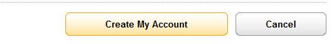
Secondary buttons should look like secondary buttons, meaning they should appear smaller and less noticeable than a primary button in the form. For example, do not make the “Enter” button and the “Cancel” button the same size. The “Enter” button is a primary button, thus it should be larger than the secondary button.
Consistency
Be consistent throughout a form, as well as in various forms you have on the same site. First, make sure that your input controls throughout a form are uniform, so your user can move through the form with greater ease. Moreover, if you are making different forms on the same site, make sure you are consistent. For example, do not use a drop-down menu in one form and an input control in another. Consistency is the key!
Group Related Data with Field Sets
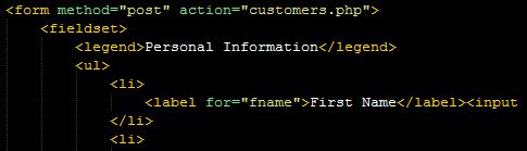
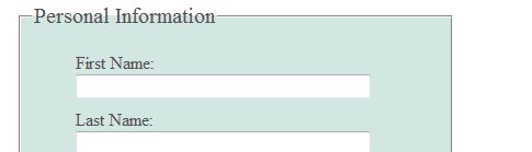
This tip is very important because it helps to organize and give the form a more cohesive feel. This practice instructs the designer to organize the data into related areas; for example, putting all personal data together, all work-related data together, or possibly all account-related information in one area. this helps the user understand the form and follow it for easily. And always use the legend tag to label the related data in the fieldset.
Order Data by Category and Categories Alphabetically
Another way to organize data in a form is by alphabetizing it. I recommend doing this so that your user can predict what information will be next, and so that they can feel like the information is organized and arranged in a manner that makes sense.
Tab Key Organized Using tabindex Attribute
Make sure the form is tab key organized; meaning that the user can just press the tab key and the cursor will allow you to go to the next input control. This not only allows for easier usability but also increases web accessibility because it allows someone to use the form without a mouse.
Refill Content Where it is Possible
This tip will make your user very happy. Try whenever possible to refill repeated information, in order to not make your user rewrite the same information over and over again. In other words, try not to ask for the same information in a form, instead have buttons that allow your user to select, “Same as above.”
Divide the Form

If the form is long, you should divide it into steps by related data. By dividing the form, you will make the user less fatigued and less overwhelmed, as the information will be in smaller more manageable pieces. Also, it will allow for previous pages to be saved, so if the user suffers from a computer problem, the whole form will not be lost. And, if you do divide the pages, make sure to show the user where he/she is in the form. For example, say page 2 of 4, so the user can see how much more is left of the form.
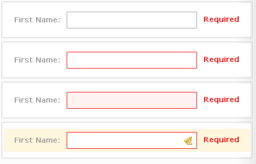
Emphasis on Location of Error
Make sure you put emphasis when there are errors on the forms, so your user can know exactly where the error is to fix it. Nothing is worst than having a user get to the bottom of a form, and press enter, only to be informed that they have imputed the information incorrectly. So, make sure to make the input control red or something next to the error, so your user can easily correct it.
Keep Correct Information Saved
If a user makes an error in the form, and they have to go back to correct that error, make sure to keep correct information saved in the form. In other words, never make a user come back with a clean form.
Use Color Correctly
Another important suggestion to improve your web form is to use colors in accordance with their general universal meaning. There are certain colors that can be understood by all people regardless of disability, age, language, or computer knowledge. The use of these various colors appropriately is essential because their understanding transcends all limitations. For example, red means error, green means correct, or yellow means alert. To take one step further, try not to depend solely on colors because there may be users who are color blind or with monochromatic screens. For example, instead of using a red asterisk to indicate a required field in a form, it is better to write out the complete word: “required” in red.
Remember Target Audience
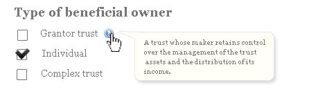
As with all designs, it is important to remember your target audience and to design it with them in mind. So, if your target audience is younger or non-technical, do not use the technical or scientific words. If you are going to use technical or ambiguous words, then provide a description of what they mean.
Be Concise
Try to be as concise and to the point as possible in all descriptions in the form, as people do not like to read unnecessary information. If you place too much unneeded information, you can be sure that your user will not read anything.
Required vs. Optional Information
Make sure to be clear about what information is required and what information is optional. This will allow for greater usability for your users, because they will first input the required information, and then they can decide which optional information they want to input.
If most of the fields are required then show what fields are optional, if the optional fields are the most then show what fields are required.