


Now that the use of CSS3 is increasing and developers are discovering new ways to replace JavaScript with CSS3 it is time to talk about the use of CSS3 for animations.
First of all, I have seen so many comments and people saying that animations should be managed only with JavaScript and doing it with CSS3 is a big mistake. However, I think the opposite, because in my opinion every time we create an animation using CSS properties to change form, color or position of elements with JavaScript, if the animation itself is changing CSS properties, then CSS should manage it. Additionally, every time JavaScript touches an element in the DOM there is penalty in the performance.
Note: We are going to use only the webkit browsers because the other browsers are not supporting the animations yet or it is very buggy. In addition, we are using the prefix -webkit but once all browsers accept and support these features we just need to remove it.
Animations Type
There are two properties for animations: transition and animation. In this part we are going to talk only about transitions.
Transitions: changes a property or a group or properties over a period of time. An advantage that the transition property has over JavaScript is the fallback, when JavaScript is not supported in a browser the animation does not execute at all; however, when the transition is not supported in the browser, the browser would not show the animation smoothly, and it would change the properties.
Why CSS3 Animations?
Our code would be easier to understand if we create the animations with CSS, even from JavaScript. The next example has a div that increase its “width” in one second when the mouseover event is fired. Then, when the mouseout event is fired the “width” is back to its original value in a period of one second. See Examples.:
Hover animation with jQuery
$('#jsdiv').hover(function(){
        //Behavior when mouseover
        $(this).stop().animate({
                   duration: 1000, //ms
                       width: 200,
        });
            }, function(){
                //Behavior when mouseout
         $(this).stop().animate({
                  duration: 1000, //ms
                      width: 100
           });
});
Similar Animation with CSS3
.divtest2{
   margin:10px;
   width:100px;
   height:100px;
   background:#8080ff;
   border:1px solid black;
   -webkit-transition: all 1s ease;
}

.divtest2 :hover{
   width:200px;
   -webkit-transition: all 1s ease;
}
Right now we can see that the animation with jQuery is more verbose, and more complex in order to execute this simple animation. Additionally, we are not even taking in consideration the amount of code is written behind the scenes for jQuery to perform the animation. The code for the animation in jQuery has a length of 294 characters and the code with CSS3 it just has 256 characters because not all the properties of in the CSS code is part of the animations. It is just the properties declared in the transition property. This would save bandwidth, less code and do more. :)
Transitions Properties
transition-property: Determines which properties would be animated.
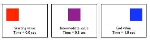
transition-duration: Set the duration of the animation from beginning to end. The time is used in seconds. I you need fractions of a seconds then you should use decimals. The default value is 0s.
transition-timing-function: set the function to take place for the animation. The functions to pick are ease, linear, ease-in, ease-out and ease-in-out. Additionally, it includes cubic-bezier which is a function for custom function based in cubic-bezier-curve. The default value is ease.
transition-delay: it is the time that the animation should wait before it start.
Transition Shortcut
The transition short cut takes four parameters in order to create the animation.
transition: property, ‘duration’, timing-function, delay.
Complex Animations with Transitions
We can create complex animations with the transitions properties using transition-delay which waits for an specific amount of time to star the animation. See example:
.divtest3{
    margin:10px;
    border:1px solid black;
    /* Properties Animate */
    width:100px;
    height:100px;
    background-color:#8080ff;
    /* End Properties Animate */
   -webkit-transition-property: width, height, background-color;
   -webkit-transition-duration: 0.5s, 1s, 1s;
   -webkit-transition-timing-function: ease, ease-out, ease;
   -webkit-transition-delay:0s ,0.5s, 1.5s;
}

.divtest3 :hover{
    width:400px;
    height:200px;
    background-color:#95d2ea;
    -webkit-transition-property: width, height, background-color;
    -webkit-transition-duration: 0.5s, 1s, 0.5s;
    -webkit-transition-timing-function: linear, linear, ease;
    -webkit-transition-delay:0s ,0.5s, 1.5s;
}
Let’s explain what is going on here:
.divtest3
Here we define the properties to react to the hover event. The animation starts when the cursor is over the div.
1) We declare the properties to animate with transition-property. Notice that the border is declared only to style the div but is not part of the animation.
-webkit-transition-property: width, height, background-color;
2) Setting the time for each of animations to take place with transition-duration property.
-webkit-transition-duration: 0.5s, 1s, 1s;
3) Setting the timing functions for each of the properties.
-webkit-transition-timing-function: ease, ease-out, ease;
4) Setting the delay for each of the properties. The animations will start in 0 seconds for the width, in 0.5 seconds for the height property, and 1.5 seconds for the background-color one.
-webkit-transition-delay:0s ,0.5s, 1.5s;
.divtest3:hover
1) We declare the properties to animate with transition-property. Notice that the border is declared only to style the div but is not part of the animation.
-webkit-transition-property: width, height, background-color;
2) Setting the time for each of animations to take place with transition-duration property.
-webkit-transition-duration: 0.5s, 0.5s, 1s;
3) Setting the timing functions for each of the properties
-webkit-transition-timing-function: ease, ease-out, ease;
4) Setting the delay for each of the properties. The animations will start in 0 seconds for the width, in 0.5 seconds for the height property, and 1.5 seconds for the background-color one.
-webkit-transition-delay:0s ,0.5s, 0.5s;
Conclusion
I hope this article have gave you the necessary means to start working with transitions and creating amazing animations. However, remember that animations are powerful and can help to make amazing websites, but please do not be annoying like creating a blink button or something like that. :) Seriously, use all animation in moderation, and remember to use it to make your design better, and not to let those animations control the design!