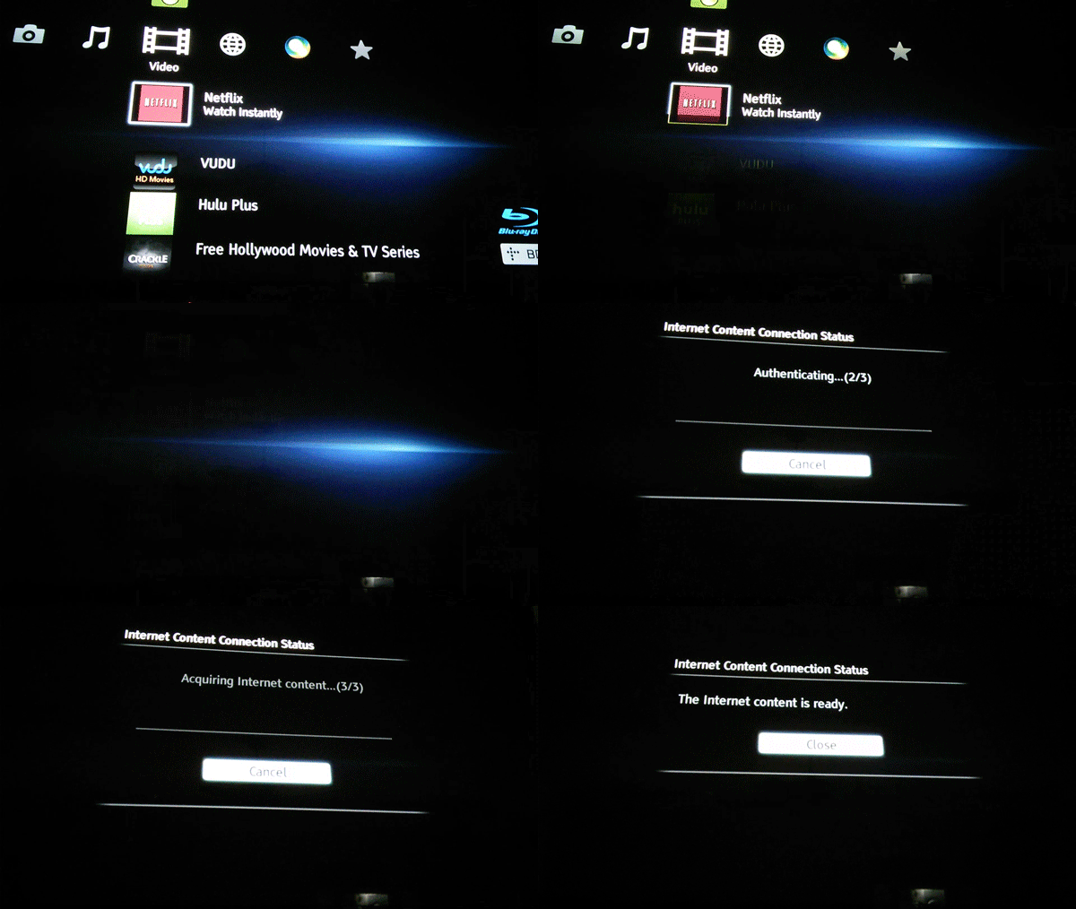
During my years using the web and electronics, I have seen a common pattern on some of the applications I had used. It is the redundancy of telling me the obvious. In this post, I will take an example from my DVD player from Sony that has this particular problem.
The DVD Player can connect wirelessly, and I use it most of the time to watch Netflix or Hulu at night. The issue I have is that every time it tries to connect to the local network, it has not only to show me the process of which is fine. But the part that I don’t understand is that at the end of the process it needs to show a message telling me that it connected successfully with a close button. Thus, every time that I need to use anything with the Internet, I have to press this close button.

The biggest problem is that as a user, I expect to connect to the internet every time I select Netflix or Hulu. I would like to see the close button with a message ONLY when I have problems on my network so I can take action. There is no reason for me to have to click on the close button each and every time I use the product. In my opinion, User Experience designers/engineers got it all wrong with this one.
The less the software is “in the face” of the users, the better. If the expected behavior of a calculator is telling you the result, why would you like to have a message from the calculator telling you that it has your answer ready to press close to continue? That is just a waste not only of time but interference with the flow between user and device. All I want is that if the device is connected to the network, then fucking proceed. Don’t wait for me to press the OK button and then load the heavy Netflix or Hulu apps. I can give you one example of how this could bother you. When you click on the selected app, you would like to go to the refrigerator and take a drink and when you come back you would like to have the listing of movies ready. But, with this problem, that is not the case because you will face the message with the close button. Then after you close the button to take 10-15 seconds (sometimes even more) to load the application with the listing of movies. I would like to have the listing ready once I come back from the kitchen. That would be ideal.
I hope that designers/developers understand that users having control does not mean that you need a button or a message for everything. There are functions that just take away the enjoyment of the application when you bomb the users with prompt messages that mean nothing to them.
This was previously posted at teylorfeliz.com


